A Magical Extra Day

“Poke your eye, pull your hair, you forgot what clothes to wear!”

If you don’t catch the reference, 30 Rock has stepped up and given long-overdue meaning to Leap Day.  Unless you have a better idea, it might be our best chance to give this awkward and abitrary day some life.

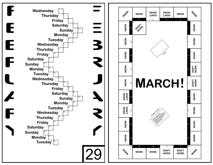
Meanwhile, if you find yourself wishing the rest of the year could have a bit of a twist to it, the Ape Con Myth 2012 Novelty Calendar is ready to serve up the next ten months in ways you’ve never seen before!  (Mainly because calendars become much less useful once you start messing with them.)

You can find the calendar, and very little else, in the fairly new Ape Con Myth shop!

Happy Leap Day!  Real life is for March!

(If Only These Were) International Pony Ride Statistics

posted in: Ape Con Myth, Maps 0

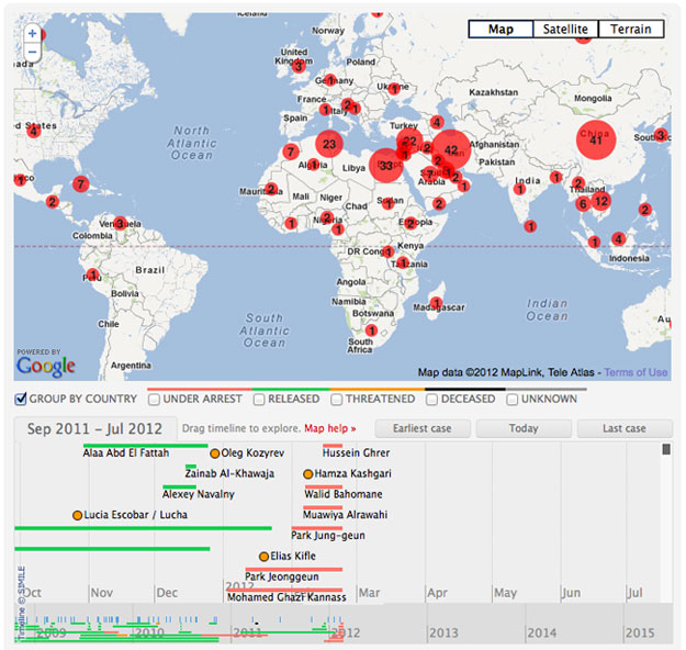
It’d be a wonderful thing if the numbers in the little red dots below were instances of ponies at birthday parties last weekend.  But no, Iran does not currently have 42 exceptionally happy children on its hands.  Those are the number of bloggers and other internet users who have been threatened, arrested or worse for their activity online.  Or at least, the known cases…

(click for interactive tracker)

The Threatened Voices tracker is a new project from Global Voices and EFF to raise awareness of Bloggers Under Fire.  From EFF:

As activists and ordinary citizens around the world are increasingly making use of the Internet to express their opinions and connect with others, many governments are increasing their surveillance and censorship capabilities and taking legal or extrajudicial actions against bloggers and social media users.

While journalists often have a newspaper backing them, not to mention a more professional sounding title, bloggers can quickly find themselves standing alone with their laptops.  The United States might have taken a dive in the latest Press Freedom Index, but there are 130 other countries where conditions are far worse for those who speak out.

To learn more about what’s happening, check out Global Voices for profiles on individual bloggers and EFF for coverage of their cases.

You knowing is half the battle.

This Wesibte Makes Things Hella Easy

posted in: External Other, Smog 1

The Ape Con Myth blog has been around long enough now that our Akismet plugin just snagged its 1,000th spam comment, and to celebrate we are going to share a few.  Most are pretty obvious bottom-of-the-barrel commercial links.  Some, however, attempt to seem legit.  In the spam game, they are known as “ham”.  And despite the misspellings, some are very difficult to delete, due to their encouraging tone…

spam comments
That’s what they are going for though.  This is what every blogger wants to hear, more or less.  And this positive feedback is yours in exchange for exposing your readers to links they probably shouldn’t visit.

Sometimes though they are so weird it’s worth sharing…

spam comments

Anyway, here’s to being around for 1,000’s more!  Don’t forget to add your own thoughts in with all the ham.

Speaking of spam, if you like to make music and enjoy a good challenge, head over to SpamSong, where each month a new title is pulled from the junk folder for you to conceptually recycle into a song.  (Who ate all the pies, indeed?!)

Manipulation of Representation

As Congress continues its six-month streak with 80%+ disapproval ratings, it is unfortunate that we can’t look to the current Congressional redistricting, based on the 2010 census data, for hope.  ProPublica has some excellent coverage of the various forces moving these lines around and, just as in Congress, neither of the two parties are setting a good example.

Speaking of, it should only take one to whet your appetite for more.  Take it away, Florida!

From ProPublica:

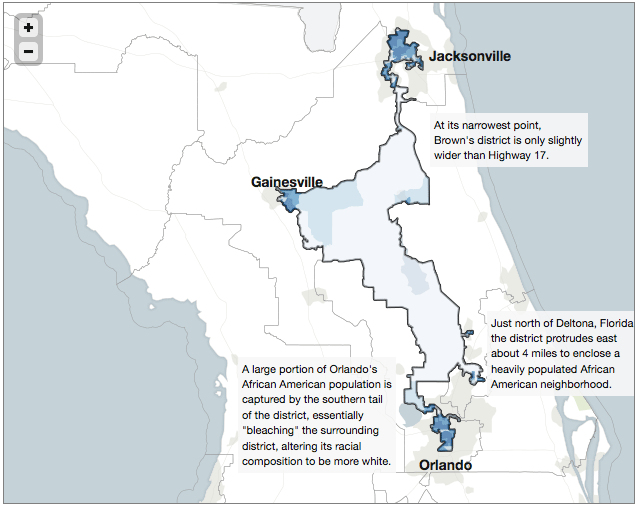
Florida’s 3rd Congressional District scoops African-American neighborhoods out of three cities to form a district that has mostly swampland in between. Districts like this one, created in the 1990 redistricting cycle, helped African-American congressional candidates win historic victories. But the districts surrounding it are now much whiter, and thus more Republican, than ever before. Many credit the 1990 redistricting with turning Florida from a blue state to a red state.

(click image for related article and more maps)

That is sadly just the beginning. ProPublica will walk you through examples of the various brands of gerrymandering currently in use in the U.S. and the names alone (cracking, packing, bleaching, hijacking and kidnapping) will give you the general drift. If that doesn’t make you sick enough, Slate has a slideshow featuring 21 of the most gerrymandered districts.

For more on the current 2010 process, check out the Rose Institute for news and info by state and the Purdue University Library for a full collection of official government redistricting sites.

[Map from ProPublica]

It’s Not Just In Your Head

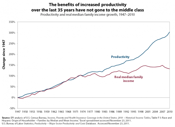
This one explains itself…

If you’re looking for more charts of the like, search no further than the Economic Policy Institute‘s The State of Working America.  The one above is from their Income & Poverty category, which brings together two things that are supposed to cancel each other out.

As long as employees are considered expenses, as opposed to, say, investments, they will continue to get squeezed rather than appreciated.

[State of Working America chart via zunguzunga]

The Future of the Fad

Believe it or not, it’s 2012 and there will supposedly be some flying cars around by the end of it.  Driverless cars are around the corner too, as are legions of robots.  It’s the future, kinda.  There’s so much in the works these days it’s difficult to discern what is actually happening and what is just California dreamin’.

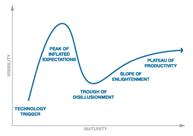
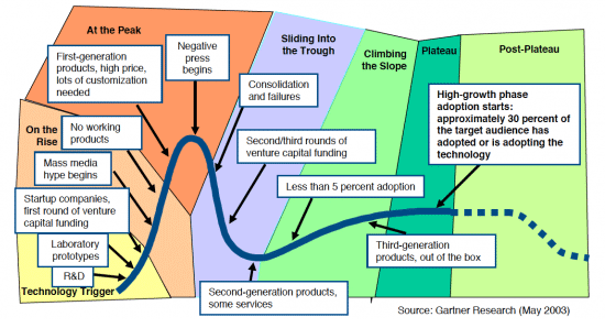
If you’re having trouble keeping up, perhaps the Gartner Hype Cycle can help.

To break it down in terms of the news you are used to hearing about new technology, check out the more detailed explanation.

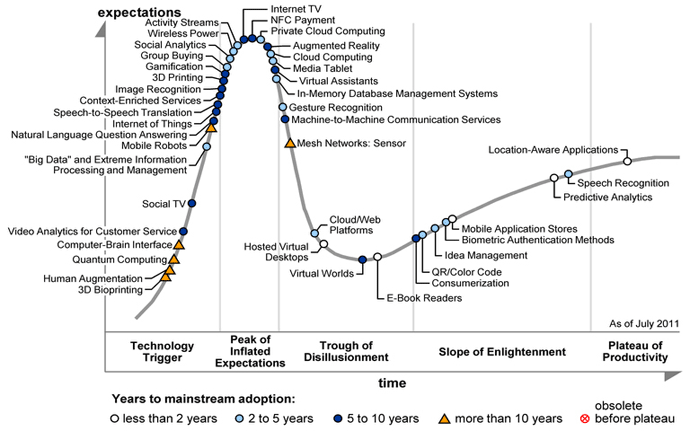
While Gartner gets far more specific about particular industries with its paying clients, once a year they release the Hype Cycle for Emerging Technologies, evaluating the maturity of the entire field of next big things…

Happy trails to all on the road to the Plateau of Productivity…

[All charts from Gartner]

What Have You Been Up To?

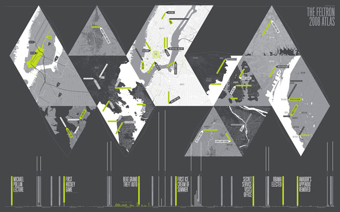
What do you remember from your day to day?  Can you recall what you did last year, last month or last week?  Nicholas Felton, aka Feltron, knows.  No, he doesn’t know what you did, but he knows exactly what he has been up to and since 2005 has shared the results in the Feltron Annual Report.

For more on the subject, we turn to Roman Mars and the 99% Invisible radio show

Below we have the on-the-ground report of Feltron’s 2008 comings and goings.  Open up his Annual Report archive in a new window to explore while you listen…

(click to jump into the 2008 report)

[Feltron.com via 99% Invisible; Thanks, Timothy!]

Get Your Perspective On

Got big plans for the weekend?  Maybe taking a short trip?

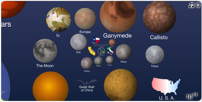
Then, here’s a golden opportunity to put it all in perspective.  Click the image to launch a wonderful presentation that will make you feel utterly small and overwhelming gigantic one after the other…

(click image to launch)

[The Scale of the Universe 2 by Cary Huang; Thanks, Andy!]

Making Lemonade from an Old and Somewhat Flawed Chart

Yesterday it was a map, today it’s a chart.

The point of this one is to say that, to be part of the world’s richest 1%, all you have to do is make $34,900 a year, after taxes.

That’s per person by household, of course, so if you’ve got a significant other, double it, and if you’ve got a couple of kids, quadruple it.  It raises the bar a bit, but the big shocker is: 29 million, or almost half, of the world’s richest 1% are Americans, just like you!

Then there’s some other countries, take a look…
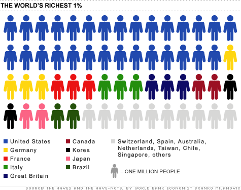
Now, this chart was part of an article on CNNMoney only a month ago, but we are told the data is from 2005.  Then you count the little chart people, find only 60, and rightly exclaim, “Hey, we hit 6 billion in 1999.”  For 2005, this chart would need four or five more people depending on which way you round it.  It might not seem like much or that long of a time, but world GDP went from $40B to $60B in the same period.  The question is, how would it change our $34,900 number?

But say you do top that number, then look around your surroundings and rightly exclaim, “Hey, I’m not rich.”  Just read the end of the article, silly.  We’re talking about the entire world here.  The world in which the global median income is $1,225/year. “In the grand scheme of things, even the poorest 5% of Americans are better off financially than two thirds of the entire world.”  …  That’s where the record skips.  If you want to hear some reactions to this conclusion, check out the 1,000+ comments that have piled up.  They range from pointing out the differences in cost of living around the world to accusing the writer of trying to take the heat off America’s 1%.

The disconnect is from measuring richness by income, as opposed to wealth.  Yes, remember wealth.  That’s what you’re missing.  Assets.  Your life should make sense again as soon as you hear that it takes $500,000 of assets to put you into the richest 1% worldwide.

How many little chart people would the U.S. get in this scenario?  37%, or 22 people.  The chart above was only off by 11%, but it completely missed the boat on Japan, which should have 16 people.  Anyway, what about the American 1%?  How much yearly income does it take to get in that club?  Well if you believe CNNMoney, they say it was $343, 927 in 2009, a measly 10 times what they were selling last month.

And before you think they might be trying to show both sides, note that this second article starts out by baiting you with the idea that it would take a million dollar income to be in the top 1%.  Surprise, you only need a third of a million!   Or, 37 times what the poorest 20% of Americans make on average, 14 times the next, 7.7 times the middle, and 4 times the fourth quintile.

As ThinkProgress would love to explain further, the American 1% owns 40% of the nation’s wealth, including 50% of all U.S. stocks, bonds and mutual funds, and takes home 24% of the nation’s income.

When it comes to world wealth, it looks a lot like yesterday’s map.
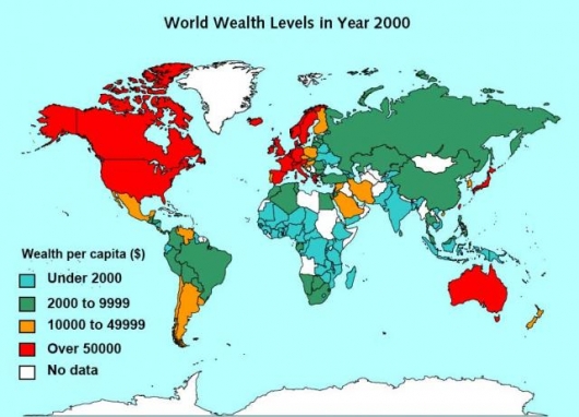
And back where we started, the crowd walks away wondering what it was all about anyhow.

[Map from World Institute for Development Economics Research via Gizmag]

Making Lemonade from an Old and Somewhat Flawed Map

We begin with a map.  A map from TD-Architects, which seems to have a lot of interesting content though remarkably difficult navigation.  A map that might be from 2006 or 2007 (or 2009?).  The source of the income data?  Unknown.

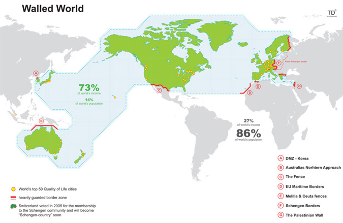
Anyway, the idea of the map is that 73% of the world’s income is being protected on all sides by walls or, as they are called, “heavily guarded border zones” in an effort to create the “greatest wall” ever built on this planet.  Go ahead, take a look…

(click to enlarge)

If you want get into the flaws of the map, reddit has conveniently ripped it apart on multiple occasions, including this 400+ comment thread.  The gist is that “heavily guarded” is an exaggeration, the selections are arbitrary, and there are plenty of wealthy areas outside these borders.  …  But is it still conceptually interesting?

While looking into the income data, it turned out that these countries within the so-called walled world match up with the World Bank‘s list of “High Income” members of the Organisation for Economic Co-operation and Development (OECD).  Since 1973, these countries have made 70-80% of the world’s income year after year, that is until 2006 when their percentage started to drop.  The situation really is changing, and as of 2010 the high income OCEDers were down to 63%, but the map really is a SNapshot Of Globalization, which is what TD’s SNOGs are all about.

Tomorrow we’ll use a somewhat flawed chart to take this a step further.

For more on those walls: DMZ, Australian Defense Force, Mexico-United States barrier, EU Maritime Borders, Melilla & Ceuta border fences, Schengen Area, Israeli West Bank barrier.

For more on the data: The World Bank is offering a killer 200,000+ line spreadsheet full of all kinds of data or if you’re more of a charts person, check it out via Google’s Public Data Explorer.

[Map via Information is Beautiful]
1 2