Seedy Industry Structure: 1996-2008

From Philip H. Howard at Michigan State:

Consolidation has increased in the international seed industry in recent decades. The chart below depicts changes in ownership involving major seed companies and their subsidiaries, primarily occurring from 1996 to 2008. The largest firms are represented as circles, with size proportional to global commercial seed market share.
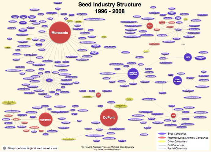
(click image to view zoom.it version)

Extra Credit: Count how many sound like food companies.
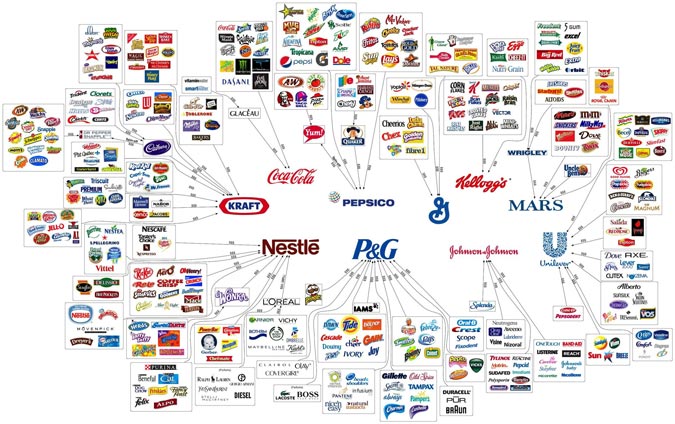
The Illusion of Choice for a New Generation

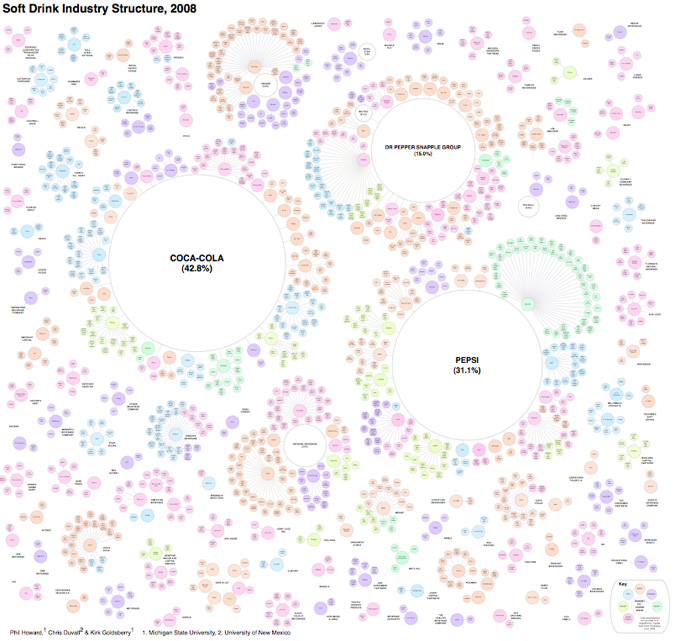
The formula for soft drinks is pretty simple, which might explain why there are so many of them on the market.  Water + a Sweetener + a Flavoring Agent = Good Margins.  Add in caffeine and fruit juice as needed.

The following chart, however, is called The Illusion of Diversity for a reason.

(click to zoom in)

It’s generally known that Coke and Pepsi are a big part of the industry, but what isn’t clear from all the choices above is that, along with the Dr. Pepper Snapple Group, the top three firms account for 89% of soft drink sales in the United States.

[via Visual Complexity] [more food and beverage-related infographics from Philip H. Howard at Michigan State University]