Waking Up on the Wrong Side of Your Head

posted in: Ape Con Myth, Maps 0

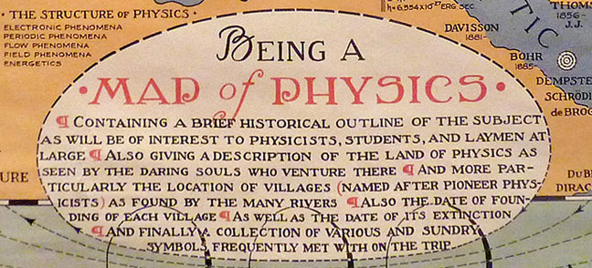
And now it’s time to play, Guess Which Way the Rankings Go!

Is 1st place South Dakota or 50th place West Virginia the state with the least or most Poor Mental Health Days?
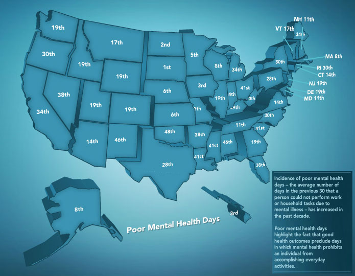
This is just one example of the fun to be had at America’sHealthRankings.org, where you’ll find both an interactive map and timeline of state performance on a wide array of health issues along with a large resource of actions you can take to support your favorite cause.

Another game to play when confronted with a somewhat random website full of stats is, Why Does This Site Exist and Who’s Behind It?  “America’s Health Rankings” is about as generic as the name under it, United Health Foundation.  The United Health Foundation, of course, was established by the United Health Group, which you might or might not recognize as the largest single health carrier in the United States.  What’s their motivation?  Perhaps the same as yours.  They probably don’t want you to have to go to the doctor either.

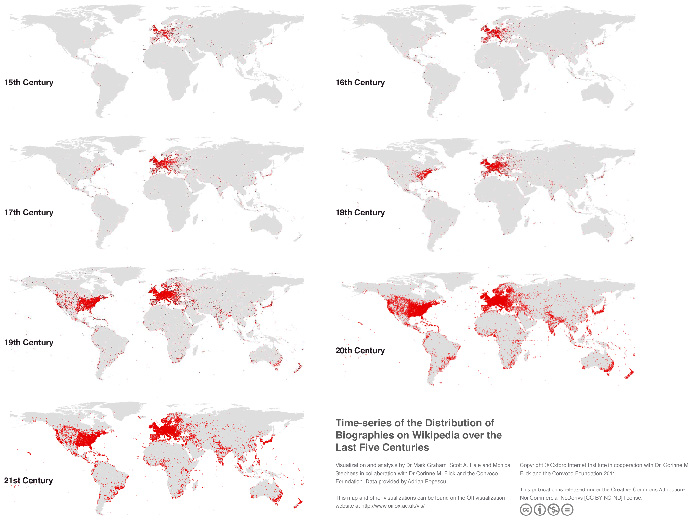
The Who’s When & Where of People with a Page on Wikipedia

Founded in 2001 to study the societal implications of the internet, the Oxford Internet Institute has a growing collection of data visualizations that sketch out the state of information proliferation worldwide.

Below we have a Time-series of the Distribution of Biographies on Wikipedia over the Last Five Centuries, which provides a startling reminder of how many people are still not part of the conversation.

To see how far our globalization has yet to go, check out the OII’s charts on Academic Knowledge and Language, User-generated Content in Google and A Geography of Twitter.

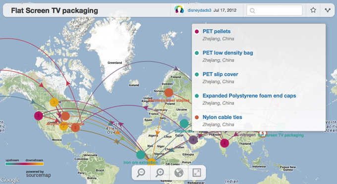
A World Working Together… To Build Boxes for TVs

How many countries does it take to screw in a light bulb manufacture the packaging for a television?

(click image for interactive map)

Magellan would be proud.

Explore Sourcemap to find out the international cooperation going into iPhones, Ben & Jerry’s, Chicken of the Sea Light Tuna and more!

The Rent Is Too Damn Median

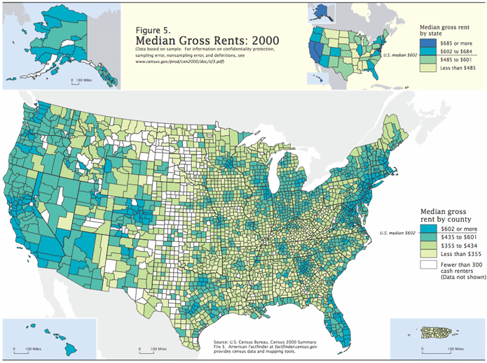
When looking at median gross rents, the extremes get washed out as location, location, location turns into everywhere.   In 2010, the U.S. median gross rent was $842/month, up from $602 in 2000.  For some perspective on the change, here’s a look back at the last few decades, with and without adjustments for inflation.

Now breaking it out by state and county with data from 2000, location begins to return as a factor.

(click to enlarge)

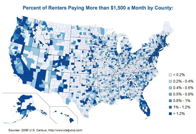
But if you live in a big city, these rents might seem completely divorced from reality.  To make sense of urban rents, you have to move the cutoff up to 2.5x the median.

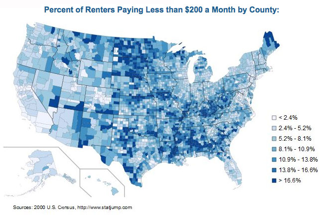
On the other hand, below you can find out where people would likely choke at the thought of $1,500/month rent.

While the percentages seem to favor cheap rent, remember that 1% of Los Angeles, the most populated county, is larger than the population in 81% of the other 3,220 counties in the U.S.

[Historical rents and 2000 Median Gross Rents map (pdf) from the U.S. Census Bureau; $1,500/$200 maps from StatJump]

The Underwater Network of Distraction

posted in: Maps, Smog 0

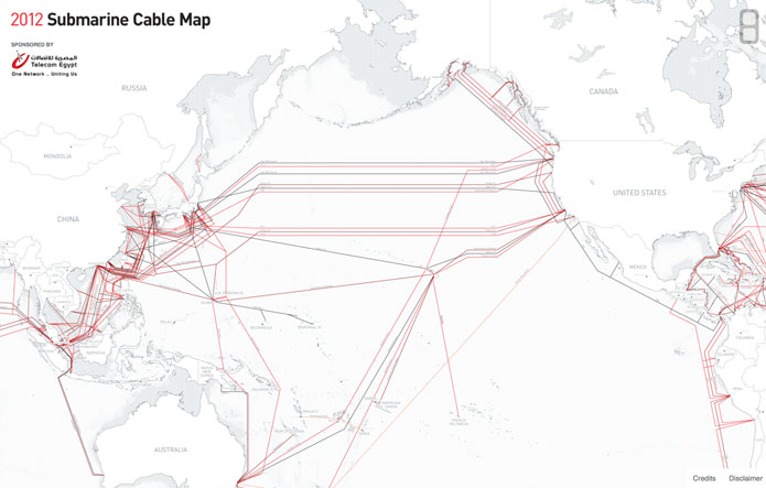
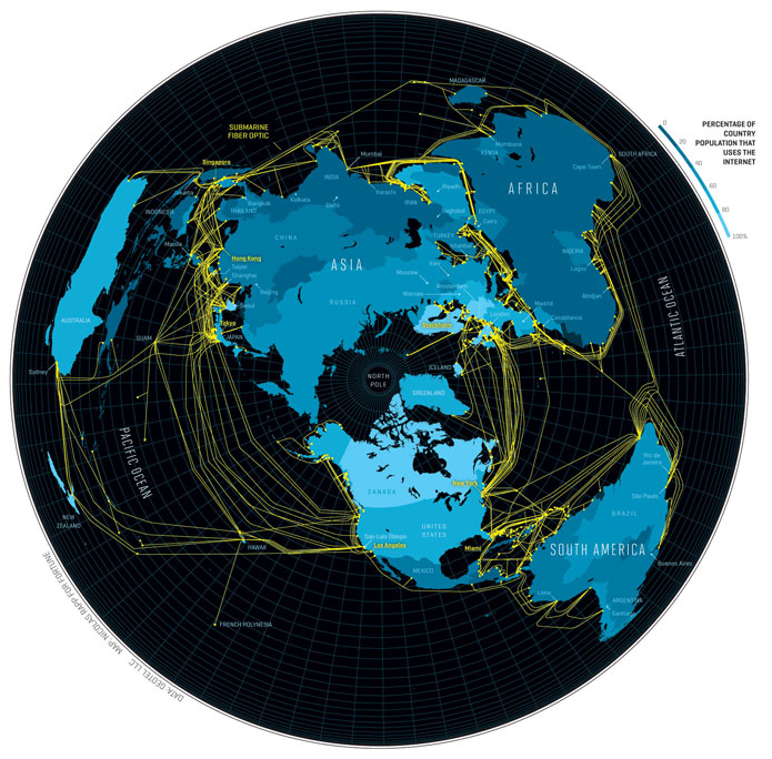
If you were wondering where we are hiding all the cords, the answer is at the bottom of the ocean.

Mapped below, you will find the fiber optic cables that make the internet a world wide web.  Zoom in to find out who is behind every one of them with the 2012 Submarine Cable Map

…or just gawk at the old school beauty of it all.

“In my day, we ran cables along the ocean floor to get our internet!”

[Maps by TeleGeography; Nicolas Rapp via Flowing Data]

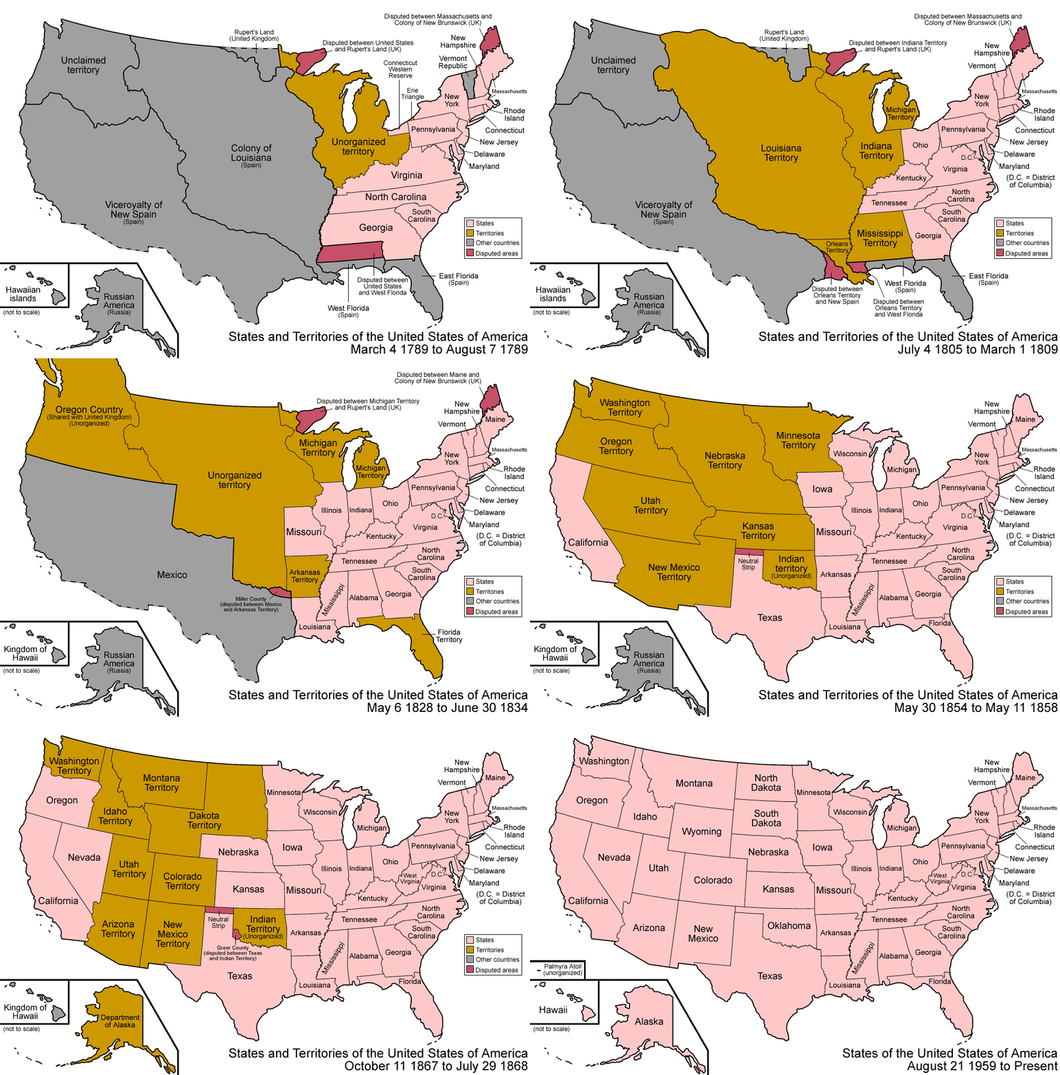
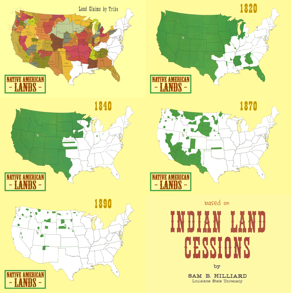
Indian Land Cessions (or Going, Going, …)

It plays out the same way every time…

To take a closer look, try the set of 67 maps collected in part two of the Eighteenth Annual Report of the Bureau of American Ethnology to the Secretary of the Smithsonian Institution, 1896-97.

[Animated gif by Somersaultr via Chart Porn]

How to Build a Better People Trap

posted in: Ape Con Myth, Maps 0

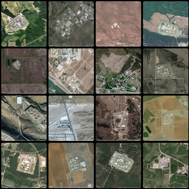
“What does the geography of incarceration in the United States look like?”  That’s the question Josh Begley asked and PrisonMap.com is where you can find the answer in the form of satellite pictures of the 4,916 federal, state, local and privately-run jails and detention centers holding over two million prisoners who call the land of the free their home…

(click image to see more)

[Prison Map via Flowing Data]
1 2 3 4 6