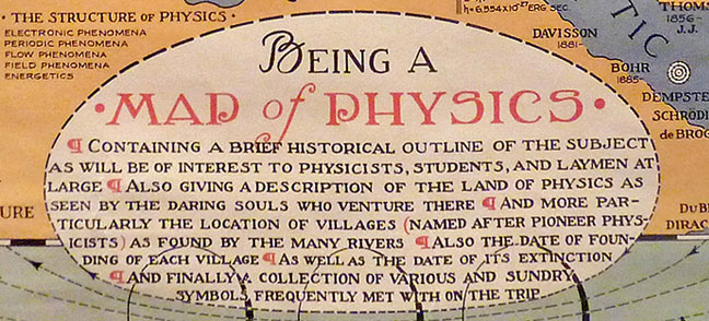
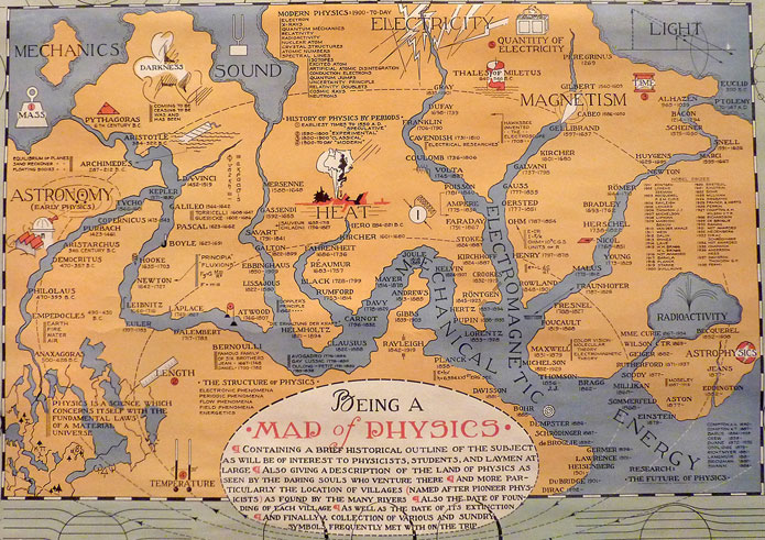
  (click image for full version in a new window)

  (click image for full version in a new window)
From Gresham’s Law:
Here we present a history of the Fed in charts. As you’ll surely glean from the below — the Fed has degenerated from a by and large passive institution (dealing only in high-quality self-liquidating commercial paper and gold) to an active pursuant of junk, an enabler of wars, a ‘benevolent’ combatant of the depressions of its own creation, a central planner of employment & prices and of course a forgiving friend to inconvenient market follies.
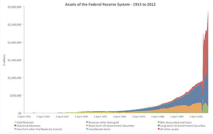
If you understood any of that, you might enjoy the accompanying decade-by-decade survey of the Fed’s assets. Everyone else can join us in hoping that someone understood it.
Prepare for some strong language and laughs in regard to some real bullshit…
Go to Let My People Vote for info by state. Take a second now to make sure you won’t get sidelined in November.
We hear about it from time to time, but what do we really know about the International Space Station? For those to whom it is still just a name, behold…
This is what it looks like…
This is how big it is…

These are the pieces it is made of…
This is what is meant by international…
And this is how awesome it is to be around..
It would be nice to look at ancient history…
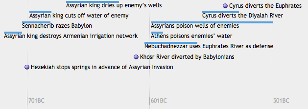
… and feel like things have changed.
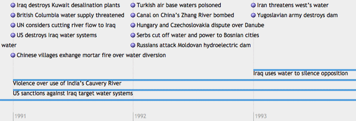
Yes, it probably would be nice.
Enjoy 5,000 years of water conflicts over at the Pacific Institute’s Water Conflict Chronology Timeline.

Oh look! Occupy Wall Street made an invitation for their Anniversary Action and forgot to color it in!
They were probably busy putting the finishing touches on plans for nine days of actions and events starting Saturday, September 15th.
Let’s do our part by coloring the invites and sending them out to our friends!
Be sure to share your version with the social network(s) of your choice and here in the comments for a chance at a free Ape Con Myth something or other!
Meanwhile, find out everything you need to know for the anniversary at #S17 , including actions in your area and this handy pdf breaking down what’s happening in NYC.
Giddy up!
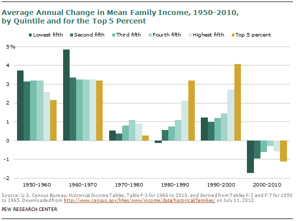
Who would have thought we’d spend the first decade of the 21st century making the 1970s look good. Everyone not shouting “I told you so!” should check out the rest of the Pew Research Center’s report: The Lost Decade of the Middle Class – Fewer, Poorer, Gloomier.
When looking at median gross rents, the extremes get washed out as location, location, location turns into everywhere.  In 2010, the U.S. median gross rent was $842/month, up from $602 in 2000. For some perspective on the change, here’s a look back at the last few decades, with and without adjustments for inflation.


Now breaking it out by state and county with data from 2000, location begins to return as a factor.
But if you live in a big city, these rents might seem completely divorced from reality. To make sense of urban rents, you have to move the cutoff up to 2.5x the median.
On the other hand, below you can find out where people would likely choke at the thought of $1,500/month rent.
While the percentages seem to favor cheap rent, remember that 1% of Los Angeles, the most populated county, is larger than the population in 81% of the other 3,220 counties in the U.S.
[Historical rents and 2000 Median Gross Rents map (pdf) from the U.S. Census Bureau; $1,500/$200 maps from StatJump]