How to Build a Better People Trap

posted in: Ape Con Myth, Maps 0

“What does the geography of incarceration in the United States look like?”  That’s the question Josh Begley asked and PrisonMap.com is where you can find the answer in the form of satellite pictures of the 4,916 federal, state, local and privately-run jails and detention centers holding over two million prisoners who call the land of the free their home…

(click image to see more)

[Prison Map via Flowing Data]
How to Plan Your Old School European Vacation

Perspective…  we can’t get enough of it.

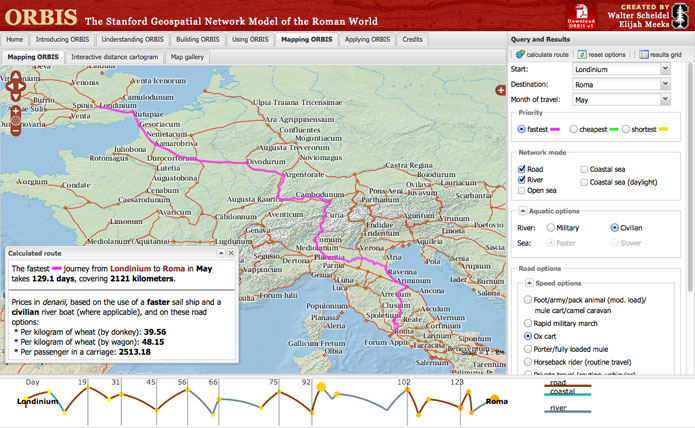
For instance, how long would it take to get you and your ox cart from London to Rome back in the days when they were called Londinium and Roma?  Those up for such a quest should get acquainted with ORBIS, The Stanford Geospatial Network Model of the Roman World:

Spanning one-ninth of the earth’s circumference across three continents, the Roman Empire ruled a quarter of humanity through complex networks of political power, military domination and economic exchange. These extensive connections were sustained by premodern transportation and communication technologies that relied on energy generated by human and animal bodies, winds, and currents.

(click image to explore)

See you in Alexandria!

[via Ars Technica]

The Best Laid Projections of Mice and GDP

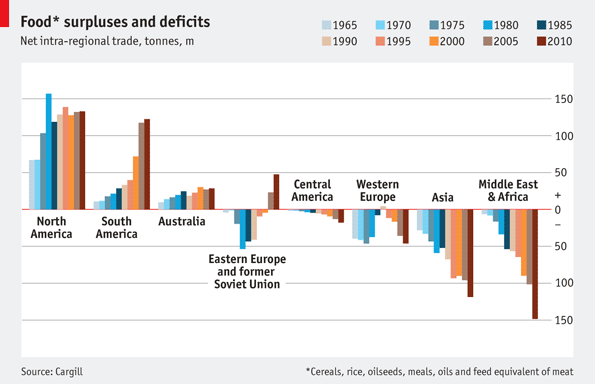
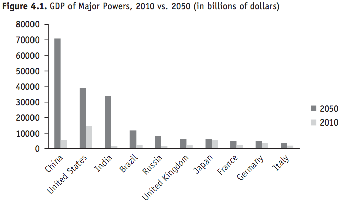
What did we know about 2010 in 1970?  What do we know about 2050 GDP in 2010?

This is what Goldman Sachs thinks…

We know/assume/hope the future will be MORE.  But how much more and what does it mean?  Numbers go up, but how real is the growth?  In the end, they are just numbers and there’s always the chance they will add up to LESS.  The wheel of fortune spins after all.

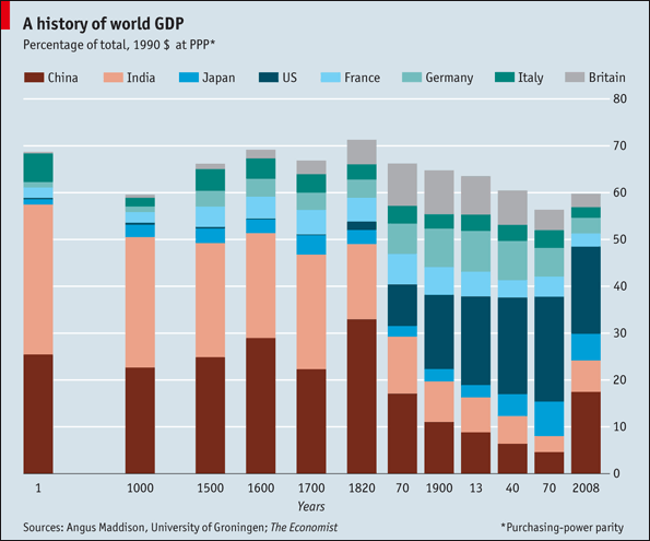
Here’s a little background on these players historically…

Imagine what this chart will look like in 4016, when we will be firmly lumped with the rest of ancient history.

[Charts via The Atlantic and The Big Picture, respectively]

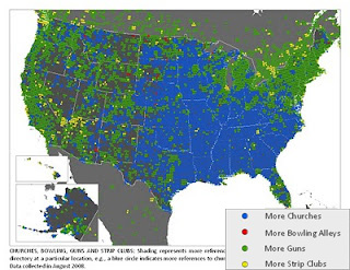
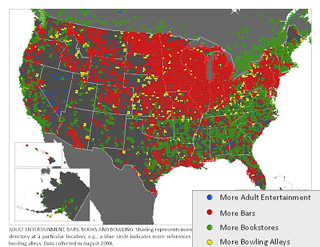
More Pizza, More Guns, More Strip Clubs

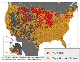
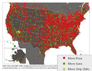
There’s probably a perfectly reasonable explanation behind every one of these data points, aside from paying customers, but until someone figures them out, enjoy generating your own theories about this collection of maps from Floating Sheep.  Each shows the prevalence of various public venues in the landscape of American culture based on results from the Google Maps directory.

Click the map for a larger version, click the match-up for the original Floating Sheep post:

[Bars vs Grocery Stores] [Adult Ent vs. Bars vs. Books vs. Bowling]
[Pizza vs. Guns vs. Strip Clubs] [Church vs. Bowling vs. Guns vs. Strip Clubs]

Find more maps and fun at Floatingsheep.org.

Great Think Tanks Steal

posted in: Ape Con Myth, Maps 0

The greatest danger within a think tank is, quite naturally, thinking too much.  Thought goes into the smallest of details on this site and even a simple post can be laden with layers.  Yet there’s only so much time and oh so many things that could use more thought.  … Or so one might think.

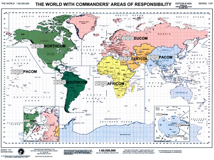
To keep things on track, Ape Con Myth seeks to utilize the work of others as much as possible.  The basic idea of this organization is that humanity already has all the answers it needs and, if anything, our job is merely to find and put together the pieces of our collective puzzle.

So, when someone has already broken down the world into manageable chunks, particularly when that someone is the U.S. Department of Defense, well, that’s one thing less to do.

We will need better patches though.  Any volunteers?

1 5 6 7 8 9 10 11 41